^ Module 5 - CRM App
CRM App - Part 3 Third Party Dependencies and Styling ( 3 of 14 )
< CRM App - Part 2 Generating Components CRM App - Part 4 Angular Services >
Overview
Time: 5min
In this lesson, we will add the Bootstrap HTML, CSS, and JS framework for developing responsive websites.
Learning Outcomes:
- How to install third party dependencies
- How to include CSS style sheets in CLI build process
- Learn about Angular Schematics
- Learn some basic Bootstrap
Install bootstrap
Time: 2min
Installing Bootstrap
- Run the following commands to install Twitter Bootstrap for Angular into your project.
ng add @ng-bootstrap/ng-bootstrap
If you open the 'package.json' file, which lists the npm packages for your project you will now see 'bootstrap' with the version number of the installed version.
If you check the 'node modules' folder in your project you will find a folder that contains all the files for Twitter Bootstrap.
Note that the following steps used to be manual but are now automatic thanks to the new Angular CLI.
Check that bootstrap has been added to the project
- Open the styles.scss file
- Note that SCSS import has been added to the main SCSS file.
styles.scss
/* Importing Bootstrap SCSS file. */
@import '~bootstrap/scss/bootstrap';
Importing in this manner via SCSS will also allow custom themes and value overrides to be applied to bootstrap styles.
This tool: (https://pikock.github.io/bootstrap-magic/app/index.html#!/editor) helps you find and test bootstrap variables to override the default theme.
If your project uses css and not scss, static bootstrap css can instead be incliuded via the styles array in angular.json
Bootstrap Ng Modules
Bootstrap also provides angular components (https://ng-bootstrap.github.io/#/home)
src/app/app.module.ts
import { NgbModule } from '@ng-bootstrap/ng-bootstrap';

@NgModule({
  declarations: [
    AppComponent,
    CompanyListComponent
  ],
  imports: [
    BrowserModule,
    AppRoutingModule,
    NgbModule
  ],
// ...code abbreviated
-
Note the NgBootstrap module has been added to the AppModule.
-
Restart the CLI with the below command. You should notice the Bootstrap styling is applied to the text on the page and the font has changed from serif to sans serif.
ng serve
You can now use Ngb components, such as bootstrap's Datepicker
<ngb-datepicker></ngb-datepicker>
Note: Under the hood, ng add command uses Angular Schematics to add the appropriate NPM packages, but also to configure everything automatically (AppModule, Angular.json, etc...)
Make a companies table
Time: 5min
Let's update the HTML we use to show a nice table format of the companies list.
Update the company-list component template
To nicely output the list of companies, follow the steps below.
- Open the company-list components' template
- Replace
{{companies | json}}with the following HTML table, which includes Bootstrap styling
src/app/company/company-list/company-list.component.html
<table class="table table-striped">
  <thead>
    <tr>
      <th>Name</th>
      <th>Email</th>
      <th>Phone</th>
      <th></th>
    </tr>
  </thead>
  <tbody>
    <tr *ngFor="let company of companies">
      <td>{{company.name}}</td>
      <td>{{company.email}}</td>
      <td>{{company.phone}}</td>
      <td></td>
     </tr>
  </tbody>
</table>
Add a Bootstrap well to the fbc-root template
- Add Bootstrap container CSS class to AppComponents HTML template
src/app/app.component.html
<div class="container">
  <fbc-company-list></fbc-company-list>
</div>
Add delete and edit buttons
Time: 2min
In the next module, we will add the ability to edit and delete companies.
Follow the steps below to add the buttons:
- Add the buttons to a new column for company edit and delete actions.
src/app/company/company-list/company-list.component.html
<td>{{company.name}}</td>
<td>{{company.email}}</td>
<td>{{company.phone}}</td>
<td class="company-actions">
   <button class="btn btn-primary">Edit</button>
   <button class="btn btn-primary">Delete</button>
</td>
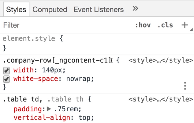
- Add the CSS class for formatting the table row.
src/app/company/company-list/company-list.component.scss
.company-actions {
    width: 140px;
    white-space: nowrap
}


.company-actions .btn {
  margin: 0 5px;
}
Notice how the custom CSS class was scoped to this component only when the build added a suffix to the end of the CSS class name.
Add title and new Company button
Time: 2min
Next, we will add a title and an "Add" button to the top of the page above the table.
- Add the following H1 element and title to the top of the company-list component
src/app/company/company-list/company-list.component.html
<h1>
  Companies
   <button class="btn btn-success float-end">Add</button>
</h1>
None of the buttons are wired up yet. We will revisit the button actions once we have a working CompanyService and router
Final code
Time: 1min
Your company-list component template should now look like this:
src/app/company/company-list/company-list.component.html
<h1>
  Companies
  <button class="btn btn-success float-end">Add</button>
</h1>
<table class="table table-striped">
  <thead>
    <tr>
      <th>Name</th>
      <th>Email</th>
      <th>Phone</th>
      <th></th>
    </tr>
  </thead>
  <tbody>
    <tr *ngFor="let company of companies">
      <td>{{company.name}}</td>
      <td>{{company.email}}</td>
      <td>{{company.phone}}</td>
      <td class="company-actions">
        <button class="btn btn-primary">Edit</button>
        <button class="btn btn-primary">Delete</button>
      </td>
    </tr>
  </tbody>
</table>